Building a standard quote template
NAVIGATION Left navigation menu > Quotes ![]() > Templates
> Templates
SECURITY Only Kaseya Quote Manager internal users assigned to the Admin role can access quote templates. To manage user roles and permissions, refer to Team.
Standard templates help you generate online quotes quickly and uniformly. Kaseya Quote Manager provides several pre-defined templates you can use or modify to meet your needs.
We recommend that you adopt a standard template for use across your organization. You can do so in a few easy steps.
How to...
- From the left navigation menu, click Quotes and then click Templates on the Quotes page that opens.
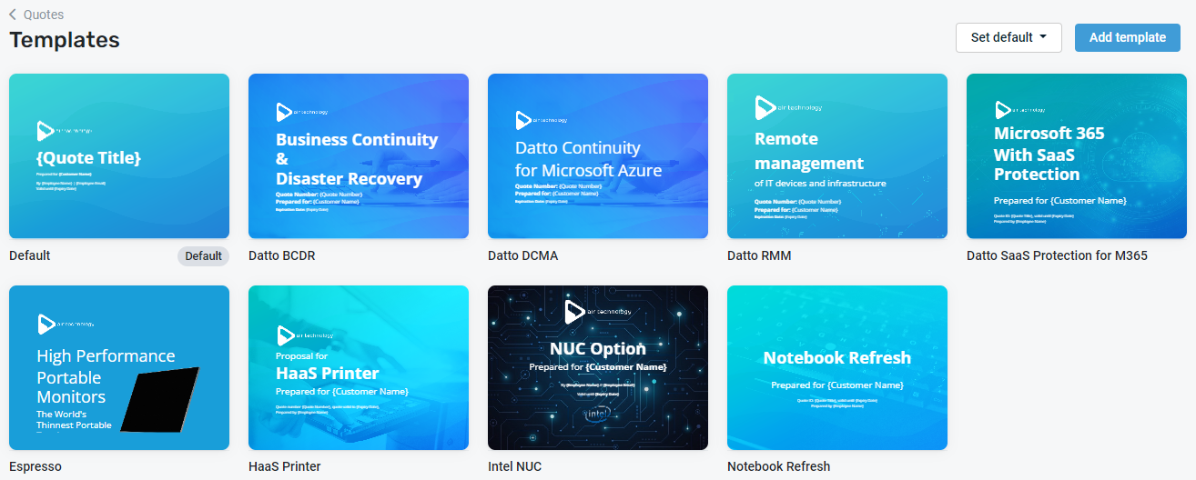
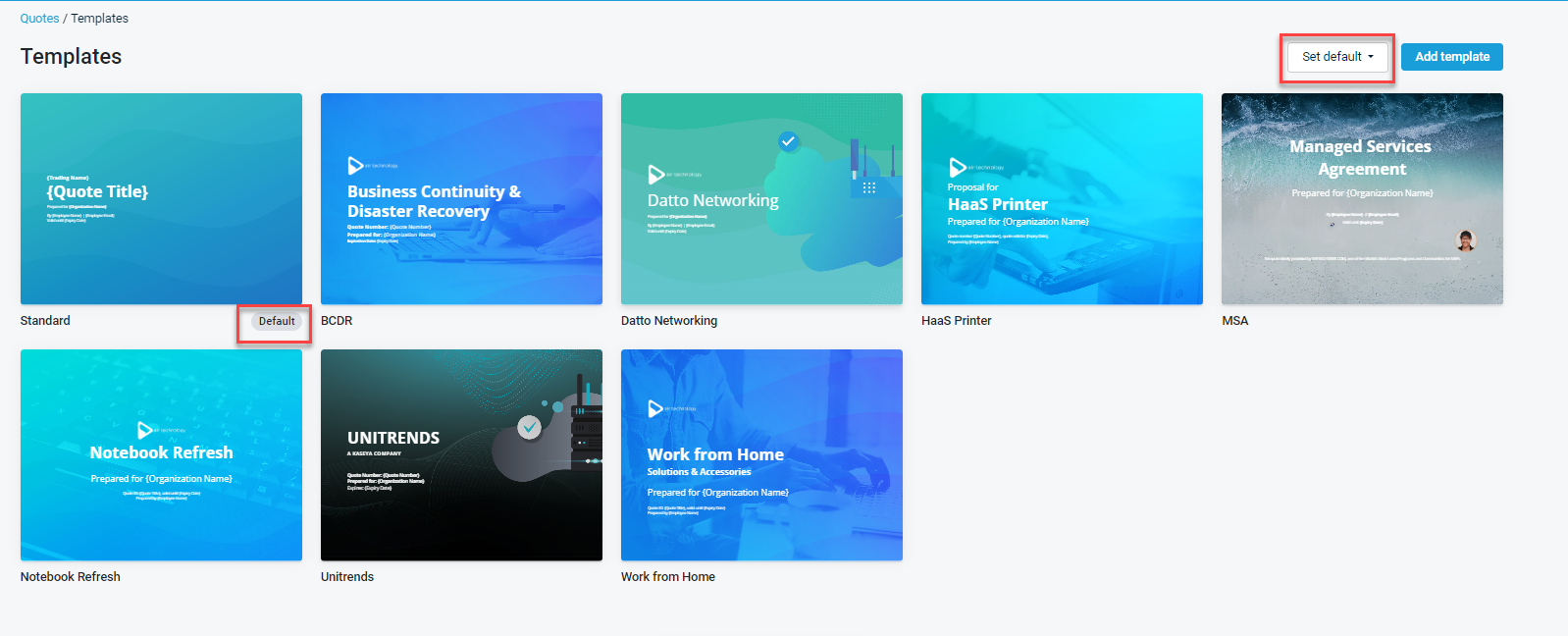
- The gallery shows all templates pre-created for you. Choose a template to use as your standard across your organization and click it to open it.
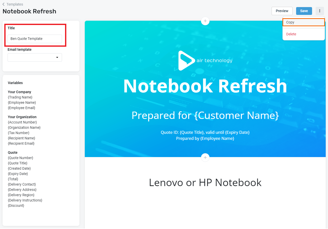
- You may choose to copy the template so that you can preserve the original version for reference. To do so, click the More icon
 and then select Copy.
 - In the cloned template that opens, enter a Title for the new template.
- Click Save and then click back to return to the main Templates page.
- From the Set default drop-down menu, select the template you copied and renamed to designate the new template as your organization's default.
NOTE The Notebook Refresh template is an ideal standard for most organizations. However, we welcome you to browse the options and determine the template that best suits your business needs. Remember that you can add and remove elements from any template at any time.

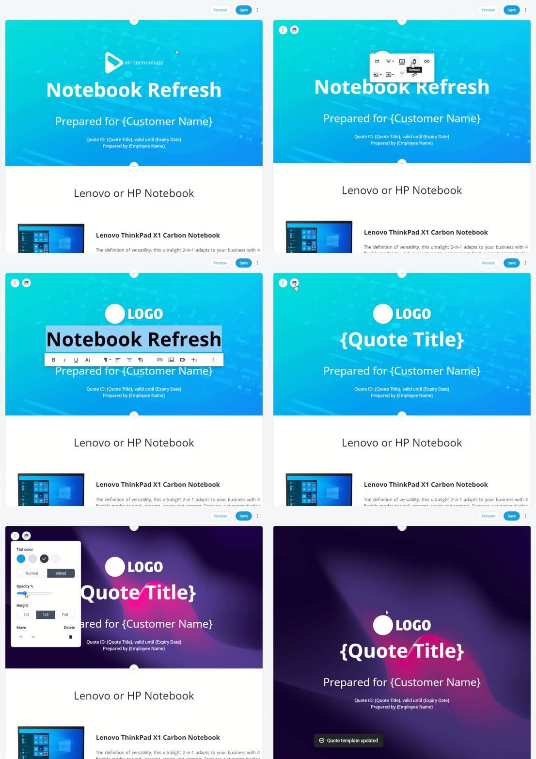
Edit the header of a sample template to better reflect your brand. As follows are a few ways to do so.
To get started:
- From the left navigation menu, click Quotes and then click Templates on the Quotes page that opens.
- Click Edit to open your default template.
NOTE This section describes how to customize a Splash header, which means the header includes a background image (as featured in the sample templates available in your gallery).
IMPORTANT Remember to Save your changes often so that you don't risk losing your template design progress.
Add your trading logo
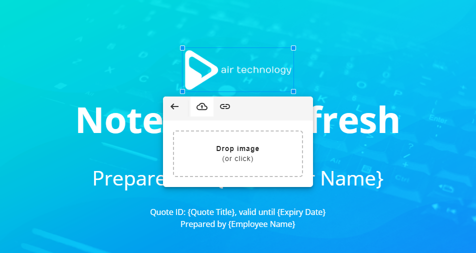
- Click the sample logo (for example, Air Technology).
- In the editing toolbar that opens, click the Replace icon
 .
. - Click the Drop image box to upload your logo from your device (or drag the logo file into the box), which replaces the sample logo with your own logo.
Replace background image
NOTE Consider browsing for options on a free-to-use stock image website, such as Unsplash.
- Hover over the sample header and click the Image icon
 that appears in the corner.
 - Select an image from your device to upload. Your selection will automatically replace the sample image.
NOTE For best results, upload a simple, text-free, high-resolution image. Refer to Splash for optimal image sizing.
Change image overlay color
- Hover over the header and click the More icon
 that appears in the corner.
 - Select a Tint color to overlay the image.
- Click and drag the Opacity % circle
 to adjust the tint color opacity, which changes the transparency of the overlay. A higher opacity creates a darker overlay.
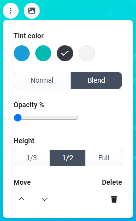
NOTE Tint color options include your Online Store Primary color and Secondary color. To learn how to change your theme colors, refer to Colors in Customizing your theme and product range. By default, dark gray and light gray are also available.
Edit text
- Click and drag your cursor to highlight a selection of sample text.
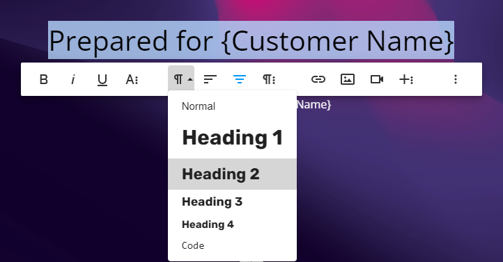
- You can type new text to replace it. To adjust the text size and style, click the Paragraph Format icon
 and select a text style or heading size from the drop-down menu.
Change text color
- Click and drag your cursor to highlight a selection of text.
- Click the More Text icon
 and select the Text Color option
  .
. - Choose from the default color options or enter a specific HEX code.
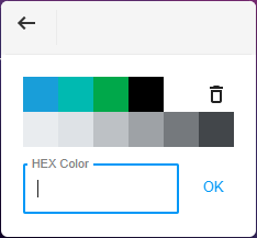
- Click OK to confirm the color change.
NOTE For a polished look, we recommend that you apply the same text color to all text in a block. If the background is dark, choose a light text color, and vice versa.
You'll notice a number of pre-defined variable fields in the left column of the quote template. These variables are designed to automate personalization in the quote creation process.
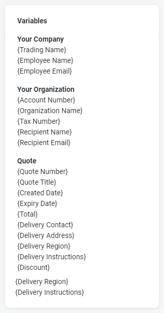
You can introduce variables while editing a quote template or while editing a specific quote. Simply type or copy/paste any of the variable options into the quote editor.
Once added, variables automatically populate based on the quote specifications you select.
EXAMPLE Let's say you type the variable {Organization Name} in a quote template. In each quote you create using that template, the variable will populate as the name of the specific organization you assigned to the quote. Therefore, when each organization views their quote, they'll see their own name.
- Click the More icon
 beside the block you want to remove.
 - Click the Delete icon
 .
. - Click Save.
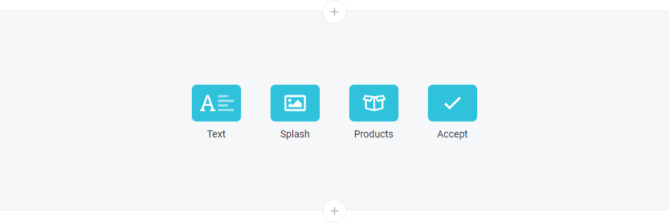
You can add any number of blocks to your quote template(s). To do so, click the plus + icon wherever you would like to place the new block.
NOTE An additional type of block, Import, is available once the quote is created. Refer to Import a supplier or manufacturer quote in Quoting from the Admin Center.
Block types
The following table describes the four types of blocks available to choose from:
| Block | Description |
|---|---|
|
Text
|
Add any information to a text block, including images, videos, and tables. |
|
|
A splash block is a text block that includes a background image (the type of block described in Customize the header of a quote template). Ideal splash block image sizes are as follows:
|
|
Products
|
A product block allows you to search for, add, and control the quantity and pricing of specific products you're offering in a quote. To learn more, refer to Product blocks in Quoting from the Admin Center. |
|
Accept
|
The accept block features a breakdown of charges and a button for your customer to accept the quote or for a Kaseya Quote Manager user to accept the quote on the customer's behalf. To learn more, refer to Quote completion and acceptance in Quoting from the Admin Center. |
Customize the block
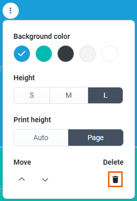
The next table outlines block features available in the More menu. To access these features, click the More icon ![]() beside any block.
beside any block.
| Feature | Description |
|---|---|
| All block types | |
|
Height
|
Adjust the width of the padding around the block by selecting S (small), M (medium), or L (large). The padding is dynamic based on the screen size of the user device. NOTE The Height setting in a splash block varies from this format. See Height. |
|
Move
|
Click the Up arrow |
|
Delete |
Click the Delete icon |
| Text block | |
|
Background color
|
From the default options, select a background color for the block. NOTE Background color options include your Online Store Primary color and Secondary color. To learn how to change your theme colors, refer to Colors in Customizing your theme and product range. By default, dark gray, light gray, and white are also available. |
|
Print height
|
The print height determines the amount of space a text block consumes in a PDF.
EXAMPLE When you select Auto, two small text blocks may display stacked together on a single page in a PDF. The blocks separate onto two different pages if you set one or both of their heights to Page instead. NOTE Once you add a certain amount of content to a text block (that is, text, images, and so forth), selecting Auto may not prevent the block from taking up a whole page. If you would like to consolidate multiple blocks onto one page, try condensing the amount of content they contain. NOTE To learn about saving and printing quotes as PDFs, refer to Save or print a signed PDF file of a quote. |
| Splash block | |
|
Tint color
|
From the default options, select a tint color for the block. The tint is a semi-transparent color that overlays the image you upload for the splash block background. To upload the image, hover over the block, and click the Image icon NOTE Tint color options include your Online Store Primary color and Secondary color. To learn how to change your theme colors, refer to Colors in Customizing your theme and product range. By default, dark gray and light gray are also available. Select Normal to produce a stark, solid overlay. Select Blend to produce an overlay that blends into your uploaded image. |
|
Opacity %
|
Click and drag the Opacity % circle |
|
|
Adjust the height of the splash block background image. Crop the image height by 1/3 or 1/2, or select Full to preserve the standard height. |
The following table outlines text controls in the basic HTML editor. To access these controls, highlight any selection of text you type in a text block or splash block.
| Group of controls | Description |
|---|---|
|
Text styling |
Bold, italicize, or underline text. Click the More Text icon
|
|
Paragraph formatting |
Change the paragraph format or text alignment. Click the Paragraph Format icon
Click the More Paragraph icon
|
|
Rich media |
Insert an image, video, or table among text. Click the More Rich icon
NOTE You may wish to add a link to a landing page you created or to a file you uploaded in Kaseya Quote Manager. Refer to Creating landing pages and Uploading files. |
|
More Misc options
|
Click the More Misc (three dot) icon |
|
Undo / Redo |
Undo or redo your latest edit. You must click the More Misc (three dot) icon |
|
Select All |
Click to select all of the text. This option is useful for applying a style to all text at once. You must click the More Misc (three dot) icon |
Quick tip: To start typing text on a new line, press Enter on your keyboard.
The following table outlines features available in the Quick Insert menu. To access these features, click on a blank line in either a text block or splash block. Then, click the Quick Insert button + that appears on the left edge of the block.
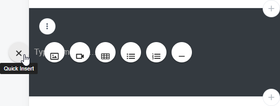
NOTE In a splash block, you must first upload a background image before accessing the Quick Insert menu.
| Control | Description |
|---|---|
|
Quick Insert (Exit) |
Close out of the Quick Insert menu. |
| Insert Image |
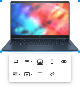
Upload a small image. Click the image to access the image controls, including the option to replace the image, change the image alignment, add an image caption, remove the image, link the image to a web page, create rounded edges, a border, or shadow around the image, add hidden alternative text to describe the image, or change the image size.
|
|
Insert Video |
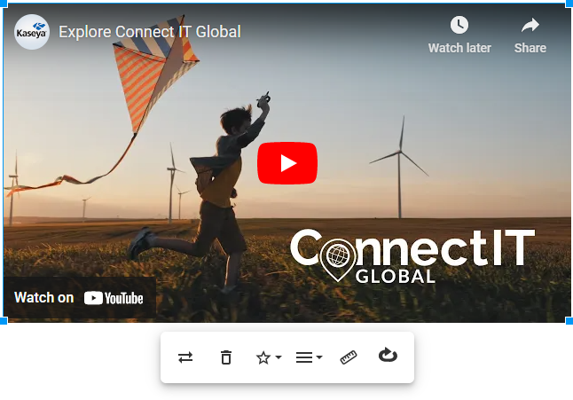
Embed a video. Simply paste the video URL from YouTube, Vimeo, Instagram, Dailymotion, or Youku to embed the video. Click the video to access the video controls, including the option to replace or remove the video, display the video inline with text or on its own line, change the video alignment, resize the video, or play the video in a continuous loop.
|
|
Insert Table |
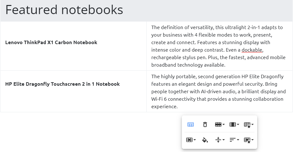
Add a table in which you can insert text or multimedia content. Click inside the table to access the table controls, including the option to add a header row, remove the table, insert or delete rows and columns, create dashed borders or alternate row colors, vertically or horizontally split cells, change the color of cells, change the table alignment, or change the cell styles.
NOTE You may choose to copy and paste a table from a word processor into the Kaseya Quote Manager quote editor. If the fixed width of the pasted table is too wide, the PDF version of the quote truncates the table. As a result, you may notice that the table does not fit properly on the PDF page. To solve this issue, in the quote editor, click the right side of the table and drag your mouse to expand its width to match the width of the editor. This forces the table back into proportional layout. You may then resize the table as needed. |
|
Unordered List |
Create a bullet point list. |
|
Ordered List |
Create a numbered list. |
|
Insert Horizontal Line |
Add a thin horizontal line to separate elements. |
To insert a new line for additional content below an element (for example, image, video, or table), hover over the bottom edge of the element and click the break line that appears.

- From the left navigation menu, click Quotes and then click Templates on the Quotes page that opens.
- In the upper-right corner of the page, Click Add template and on the blank canvas that opens, customize the template. Refer to the following for guidance:
NOTE Alternatively, you can create a quote template from a quote that you have already produced. Refer to Create a quote template from an existing quote.
Working with quotes
Once you have created a standard quote template, you're ready to start building and sending eye-catching, dynamic quotes.
Refer to Quoting from the Admin Center to learn how to do the following and more:
- Offer specific products and services in a quote.
- Link a quote to an opportunity or sales order.
- View and restore previous versions of a quote.
- Preview, save, and print a quote.
- Send a quote to an organization.
Refer to Quoting from the Online Store to learn how to initiate a quote directly from items added to a cart in the Online Store.


